
The Boagworld UX Show
Paul Boag
Boagworld is a podcast about digital strategy, service design and user experience. It offers practical advice, news, tools, review and interviews with leading figures in the web design community. Covering everything from usability and design to marketing and strategy, this show has something for everything. This award-winning podcast is the longest running web design podcast with over 380 episodes.
- 1 hour 18 secondsWebsite Rebuilds, AI Tools, and UX in 2026
This month, Paul and Marcus get into a tool that has made Paul cancel his Figma subscription, walk through how Paul has completely changed the way he approaches website rebuilds thanks to AI, and round things off with the latest thinking from Nielsen Norman Group on where UX is heading in 2026.
App of the Week: figr.design
Paul has been road-testing AI design tools as part of a workshop he ran on AI and UI, and after going through dozens of them, one stood out: figr.design.
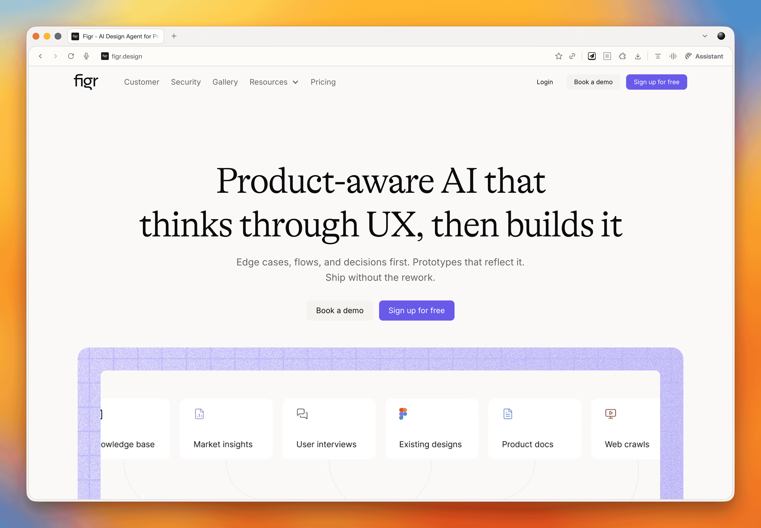
What makes it work where others fall short? A few things. It lets you feed in a significant amount of context upfront, things like style guides, design systems, and personas, which means the output is far more tailored than the generic average you often get from AI design tools. Iteration is also genuinely fast. You can queue up a whole list of changes and it processes them all in one go, rather than making you wait between each tweak.
The prototypes it produces are more realistic than what you would typically get out of Figma. Text fields you can actually type in, accordion states that open and close, button states, fully responsive layouts. Not exactly revolutionary in theory, but refreshingly functional in practice. Export to Figma is available when you need it.
The main limitation is that you cannot manually adjust elements yourself. Everything goes through the conversational interface. Paul has also been looking at a tool called Inspector, which runs locally and connects to the Claude API so you pay as you go rather than a flat monthly token allocation. It has been a bit fiddly to set up but worth keeping an eye on.
For anyone regularly using Figma for wireframing and prototyping, it is worth giving figr.design a proper look. The shift Paul describes, from hunching over Figma to leaning back and having a conversation with the tool, is a fairly good summary of where this kind of work is heading.
Rebuilding a Website in 2026
Paul has fundamentally changed how he approaches website rebuilds, and the shift is largely down to AI making a genuinely hard problem, getting good content onto a website, a lot easier.
The old problem
Website rebuilds have traditionally meant migrating existing content into a new design. Which sounds fine until you remember that most of that content was written by subject matter experts who know their field but have never thought about writing for the web.
The result is pages that lecture rather than help, that bury the things users actually want to know, and that rarely arrive on time, because the content phase is almost always where projects stall.
Why things are different now
AI has changed three things meaningfully.
- First, generating content is no longer the enormous manual effort it used to be.
- Second, doing the research that informs good content, finding out what users actually ask, worry about, and need, is much simpler with tools like Perplexity.
- Third, AI-powered search engines are pushing toward a more question-oriented approach to content anyway, which makes getting this right more important than it used to be.
How Paul works now
Here is the process Paul walks through for a rebuild project.
1. Online research
Using Perplexity, Paul researches the audience. For a well-known client, he'll ask specifically about them. For a smaller or niche client, he looks at the sector. He is looking for the questions people are asking, the tasks they are trying to complete, their objections, goals, and pain points. This takes about 10 minutes.
2. Personas
The research output goes into AI, which identifies patterns and segments it into a set of personas. A couple of hours of back and forth to get these right.
3. Company overview
Paul records his kickoff meeting with the client and points AI at the transcript. Out comes a clean summary of what the company does, its products and services, and how it talks about itself. An hour for the meeting, plus 10 minutes for the summary creation.
4. Top task analysis and information architecture
If time and budget allow, Paul runs a formal top task analysis, collecting and prioritizing the questions users most want answered. For card sorting, he uses UX Metrics. If there is no time for that, AI brainstorms the top tasks from the personas and company overview. Either way, those tasks get fed into an AI-generated information architecture.
5. Building out the IA
Paul builds the IA in the CMS or in Notion, assigning the relevant tasks and questions to each page. Stakeholders can see the structure and understand what each page is there to do before a word of copy is written.
6. Getting stakeholders to contribute
Rather than asking stakeholders to write content (a recipe for delays), Paul asks them to do two simpler things for each page: bullet-point answers to the questions assigned to that page, and any other talking points they want included. Bullets only. No pressure to write.
7. Writing the content with AI
This is where it all comes together. Paul sets up an AI project with four inputs:
- A web copywriting best practice guide covering readability, structure, and scanning
- A company-specific style guide built from existing brand materials
- The audience personas
- The company overview
For each page, he drops in the questions and stakeholder bullet points, and the AI drafts the content using all of that context. Paul recommends Claude for writing tasks. The result is copy that actually reflects the company's voice and addresses what users need, rather than generic filler.
8. Review and refinement
Stakeholders review the draft and leave comments, ideally directly in Notion where AI can read the page, take in the comments, and rewrite accordingly. One more pass by stakeholders and it is ready to go.
Paul has been using this approach on half a dozen projects and reckons you can work through a full site's worth of content in about a week (depending on size) once the setup is done. For clients, it is a service worth paying for because it takes the content burden off them while producing noticeably better results than migrating whatever was already there.
One thing Paul is careful to flag: this does not mean starting from absolute scratch every time. Old articles, compliance pages, event databases, templated content that just has to be there, all of that can still come across. The point is to treat migration as the exception rather than the default.
Read of the Week: State of UX 2026
The Nielsen Norman Group article Design Deeper to Differentiate confirmed, in Marcus's words, most of what Paul has been saying for the past year. Paul took this as further evidence he is always right!
A few of the key points from the article:
UX has stabilized after the 2023-24 downturn, but teams are leaner. UX practitioners are now expected to cover more ground and demonstrate business impact rather than just shipping deliverables.
AI fatigue has set in, both among designers tired of the "you're being replaced" narrative, and among users who have grown skeptical of AI features that add sparkle without actually improving anything. The article argues that trust is now the central design problem for AI-powered products, covering transparency, control, consistency, and what happens when things go wrong.
UI quality is becoming commoditized. If your value is primarily in making interfaces look good and work correctly, the ceiling on that work is dropping. Real differentiation lives in service design, content strategy, complete user flows, and the connective tissue that links everything together over time.
The hard-to-automate skills, taste, contextual understanding, critical thinking, and judgment, are where humans still add the most value. To thrive, the article suggests UX practitioners need to position themselves as strategic problem-solvers with a broad toolkit rather than deliverable-focused specialists doing what it calls "design theater."
Paul agreed with all of it. Marcus mostly agreed too, while noting that it must be genuinely difficult to be a UX specialist inside a large organization right now, particularly in teams that have cut so far back that one person is expected to cover the entire discipline. The answer, in Marcus's entirely unbiased view, is to hire Headscape!
Marcus' Joke
I stole a neck brace from the hospital. I feel kind of bad, but at least I can hold my head up high.
17 March 2026, 12:00 pm - 1 hour 18 secondsFrom Agency Work to Product Success
This episode we're joined by Stu Green, a product designer, agency founder, and serial app builder who's sold not one but two successful SaaS products.
We dig into the realities of building your own product versus running an agency, the role AI plays in modern product development, and whether the flood of AI-built apps is a threat or an opportunity for professionals.
Plus, we check out Bleet, an app that turns your meeting transcripts into social media content, and Paul shares how AI-powered personas are changing the way he approaches user research.
App of the Week: Bleet
You know you should be posting on LinkedIn. You've told yourself that every week for the past 6 months. But then you sit down, stare at the blank post box, and realize you have absolutely no idea what to write about. So you close the tab and promise yourself you'll do it tomorrow. You won't.
Bleet is an app built by Stu Green (and collaborator Nick) that solves this by mining the conversations you're already having. It takes your meeting recordings and transcripts, extracts the key topics using AI, and helps you turn them into social media posts. And the thing that sets it apart from just asking ChatGPT to write something for you is that it pulls your actual words and phrases from the conversation, piecing them together into posts that genuinely sound like you rather than generic AI slop.
How It Works
You connect your meeting recordings or transcripts (or even just speak a thought into the app), and Bleet will surface a list of topics you covered. From there, you pick the ones you want to post about and hit "create." You can dial in how much creative liberty the AI takes, from near-verbatim to lightly polished.
So you sit down for 10 minutes once a week, pick a handful of topics, schedule them up, and you're done. A single meeting can generate enough content for almost a week of daily posts.
What About Client Confidentiality?
The number one concern people raise is about sharing sensitive client information. Bleet strips out client names, specific people, and identifiable details. It focuses on the general topic and the ideas discussed, not the specifics of who said what in which meeting. And of course, you review everything before it goes anywhere, so if something feels too close to the bone, you just skip it or edit it.
Topic of the Week: Building Products vs. Running Agencies
Stu Green has lived both lives. He's run agencies, built products from scratch, and sold 2 SaaS businesses. So what's the difference between building for clients and building for yourself? Quite a lot, as it turns out.
Start by Solving Your Own Problem
Both of Stu's successful apps, a project management tool and HourStack (a time management app), started the same way: he needed something that didn't exist. The project management tool grew out of running his own consultancy. HourStack came from juggling small children and fragmented work hours, and wanting a way to visualize and stack little blocks of productive time.
If you're genuinely your own best customer, there's a good chance others like you exist. And if even 2 or 5 or 10 of them show up, you've got the start of something real.
The Myth of "I One-Shotted This"
AI has made it dramatically easier to build apps, but Stu is refreshingly honest about the gap between a demo and a product. Sure, he cloned entire apps in a single prompt and it looked great. But behind that impressive facade? Hours of iteration, hosting setup, video infrastructure, S3 servers, and a stack of decisions that require real product-building experience.
The people posting "I built this in one shot" on X are technically telling the truth, but they're showing you the Hollywood set, not the house behind the door. Getting from prototype to something you can actually charge money for still takes professional knowledge. You need to know what questions to ask, which answers are good, and when you're being led down a rabbit hole.
Two Tiers of AI Tools
Paul and Stu landed on a useful mental model: there are essentially 2 categories of AI building tools.
- Tools for everyone: Platforms like Lovable or Figma Make that let anyone create a basic app or prototype. Great for personal use, proof of concepts, and quick experiments.
- Tools for professionals: Things like Cursor and Claude Code that enhance a developer's ability to build production-quality software faster and better, but still require real expertise to use well.
Think of it like desktop publishing in the '90s. When it arrived, everyone panicked that graphic designers were finished. Instead, regular people made terrible flyers with Comic Sans, and the professionals used the same tools to produce better work, faster. AI-built apps are following the same pattern.
The 3-Stage Development Model
Paul offered a framework for thinking about where AI fits in the build process:
- Prototype and proof of concept: Anyone can do this with AI tools. Great for validating ideas quickly and cheaply.
- The production build: This still needs a professional. Security, scalability, accessibility, solid architecture: these are non-negotiable if people are paying to use your product.
- Post-launch iteration: Once a professional has laid a strong foundation, less technical people can step back in and make tweaks and improvements with AI assistance, because they're working within a well-built structure.
A Revenue-Sharing Model Worth Considering
Stu floated an interesting agency model: instead of charging a client the full upfront cost to build their app, what if you took partial ownership? The client pays a smaller retainer and upfront fee, you build and host the product, and you share in the revenue. If the app takes off, everyone wins. If it doesn't, your exposure is limited.
The key is picking partners carefully. They need to bring the marketing and audience side of the equation, because your job is the infrastructure and development. It's a model that silverorange, a Canadian agency, used successfully with e-commerce clients years ago, and it still holds up.
When to Sell
Stu sold both his apps when they hit what he calls "the plateau," that point where growth flattens and your churn rate starts catching up with new customer acquisition. At that stage, you either invest heavily to push through (hiring, scaling infrastructure, customer success teams) or you sell to someone who wants a product with proven recurring revenue.
For Stu, as a creative who'd rather build new things than manage database consultants and customer support, selling was the obvious choice. He used brokers both times, people who handle the paperwork, the letter of intent, and protect both sides of the deal. They take a cut, but they also sent chocolates, so it all evens out.
Finding the Right Ideas
With everyone building apps now, how do you pick the ones worth pursuing? Stu's answer is to not go it alone. Find partners who are excited enough about the idea to invest their time and audience. If you pitch an idea and nobody wants in, that's useful information. If someone does, you've got both validation and a distribution channel on day one.
He tested this with an AI running coach concept, reaching out to local running coaches in Jacksonville. When they responded with polite indifference, he moved on rather than sinking months into a product nobody was asking for.
Read of the Week: AI-Powered Personas
Paul shared his latest obsession: using AI to breathe new life into user personas. He's written 2 articles for Smashing Magazine that walk through the process:
- Functional Personas With AI: A Lean, Practical Workflow: How to build genuinely useful personas that focus on what people are trying to do, not just demographic data.
- AI In UX: Achieve More With Less: Broader lessons from using AI across user research, design, development, and content creation.
The approach: take all your research (surveys, interviews, call logs, analytics) plus deep online research from tools like Perplexity, feed it into AI, and generate highly detailed personas, far more detailed than the traditional single-page variety. Then load those personas into a project in ChatGPT, Claude, or Gemini, with instructions to answer questions from the persona's perspective.
The result is something you can consult in every meeting, on every decision. A product team can upload photos of next season's lineup and ask "what would our audience think?" A web team can test wireframes against the personas. Real user research still matters, of course, but this approach makes research-informed thinking available at a frequency and scale that traditional methods never could.
Marcus's Joke
"I tried to steal spaghetti from the shop, but the female guard saw me and I couldn't get pasta."
Courtesy of comedian Masai Graham. And yes, it's exactly as bad as you think.
17 February 2026, 12:00 pm - 51 minutes 30 secondsThe UX Reckoning: What 2026 Holds for Our Industry
In this episode, we kick off 2026 with a candid look at where the UX industry stands and where it's heading. We dig into a thought-provoking article from Nielsen Norman Group, share our hopes (and fears) for the year ahead, and explore a fantastic design pattern catalog focused on building user trust. Plus, we discuss why generalists might just be the unicorns the industry needs right now.
Topic of the Week: Preparing for 2026 and the UX Reckoning
We spent a good chunk of this episode discussing an article from the Nielsen Norman Group that, while technically published in early 2025, remains just as relevant today. Written by Kate Morin, Sarah Gibbons, and others at NNGroup, it tackles the challenges facing our industry head-on.
UX Is Back on the Chopping Block
Let's not sugarcoat it. It's been a tough time for UX professionals. Layoffs have hit hard, particularly in the US, and there's a palpable sense of doom and gloom floating around LinkedIn and other professional spaces. We've seen this before, though. We set up Headscape right in the middle of the dot-com bust, after being laid off ourselves. It wasn't fun, but times like these have a way of separating the wheat from the chaff.
Economic downturns tend to clear out people who jumped into UX because they saw easy opportunities, leaving behind those with genuine understanding and passion for the work. And despite all the negativity online, the World Economic Forum actually ranked UX design as one of the 8th fastest-growing industries. So the discipline itself isn't dying. There's just been a mismatch between the number of people entering the field and the reality of what the market can absorb.
The Rebranding Debate Is a Red Herring
Some people are suggesting we rebrand UX to "product design" or "experience design" to solve our problems. We don't think that's the answer. The word "design" does carry some baggage. In many business minds, it's seen as a luxury rather than a business-critical function. So when budgets get tight, "design" gets cut while "conversion optimization" and "customer retention" survive. That's a perception problem, not a naming problem.
The real issue is that there are too many low-quality UX practitioners who've been churned out through bootcamps. They've been taught a process to follow, and they follow it come what may. That's not their fault; they were taught that way. But six months of bootcamp doesn't prepare you for the messy, contextual reality of actual UX work.
The AI Reckoning
The negativity around AI on LinkedIn has been phenomenal lately. There's anger about "AI slop" and a general feeling that it's no good for anything. Paul posted about using AI to help create personas and do online research, and got absolutely slated for it.
AI is just a tool. Like any tool, if you use it badly, you get bad results. If you use it well, it can be genuinely helpful. The good news is that we're finally moving past the "AI for AI's sake" phase. We're starting to see thoughtful integration of AI into products and services, AI that actually solves real user needs.
Every technology goes through the same cycle. Remember video recorders? First, we were just amazed the technology worked at all. Big analog buttons, you started recording and stopped recording, and that was it. Then manufacturers added more and more features until the things became unusable with their tiny buttons and complicated preset systems. Then someone invented a code you could enter from the Radio Times to set recording times automatically. And finally, Sky came along with "press a button and it records." AI is going through that exact same evolution right now.
Shallow UX Is Suffering (and That's Okay)
Templates, processes, production-line UX: that stuff is really struggling, and it will continue to struggle. AI can do that now. You're not going to make money or build a career by blindly following the double diamond and churning out deliverables.
What you need going forward are distinctly human skills: critical thinking, taste, knowing whether something is heading in the right direction, and navigating messy organizational dynamics. Those are the skills that matter. Soft skills like relationship building, facilitation, and empathy are going to be far more valuable than whether you can use Figma.
Stop Worshipping Templates and Processes
UX is messy. You can't box it up the same way on every project. Templates and checklists are great starting points, but they're not a substitute for thinking. Context is everything.
There's no such thing as best practice. When someone from Google or Facebook says you need a 6-week discovery phase with facilitated usability testing of at least 6 people, and sure, that probably worked great for their situation, with their team, their product, and their stakeholders. But it doesn't mean it's right for your startup or your client with a third of the budget and massive internal politics.
If you've been taught a linear process, shift your mindset. Don't have a process. Have a toolkit of techniques you use as and when appropriate. You don't always need a discovery phase; sometimes a quick phone call is enough. You don't always need journey mapping; sometimes that's just not appropriate.
Don't Lose the Human Connection
Be careful that all these AI-powered conveniences don't cost you your connection with actual users. It's tempting to just run surveys, do unfacilitated remote testing, or let AI do online research. But you don't build real empathy that way.
When you sit down to write copy or design an interface, you want to be able to picture the person in your head. You want to feel who they are, what they'd say, what they'd struggle with. The more levels of abstraction between you and your users, the harder that becomes. Even if it's just talking to one or two customers, make sure you're seeing them as real people.
Become a Unicorn (a.k.a. Generalist)
For years, we've been told to specialize. But now? We need to become more comfortable wearing multiple hats. You might be doing wireframing, user research, strategy work, and training, all in the same week. You might need to understand adjacent fields like marketing, business strategy, data modeling, or product management.
AI can help extend your capabilities. Maybe you know a bit about accessibility or SEO, but not enough to do a full audit. With AI's help, you can now be better in those areas. Still not as good as a specialist, but better than you would have been alone.
Stop focusing so much on outputs (wireframes, reports) and start focusing on outcomes. Elevate your thinking from tactical to strategic.
If you want to dig deeper into this, check out Paul's free email course. It's 30+ emails on thinking more strategically and holistically about UX.
Read of the Week: Design Patterns Catalog by Projects by If
We stumbled across a brilliant resource from an agency called IF. They've created a design patterns catalog with a particular emphasis on building trust through transparency, user control, and thoughtful approaches to consent and data sharing.
This is increasingly important, especially as AI becomes more prevalent. It's not about slapping a testimonial on a page and calling it done. It's about baking trust into the experience itself. The catalog is beautifully illustrated and well-explained, making it a great scannable reference.
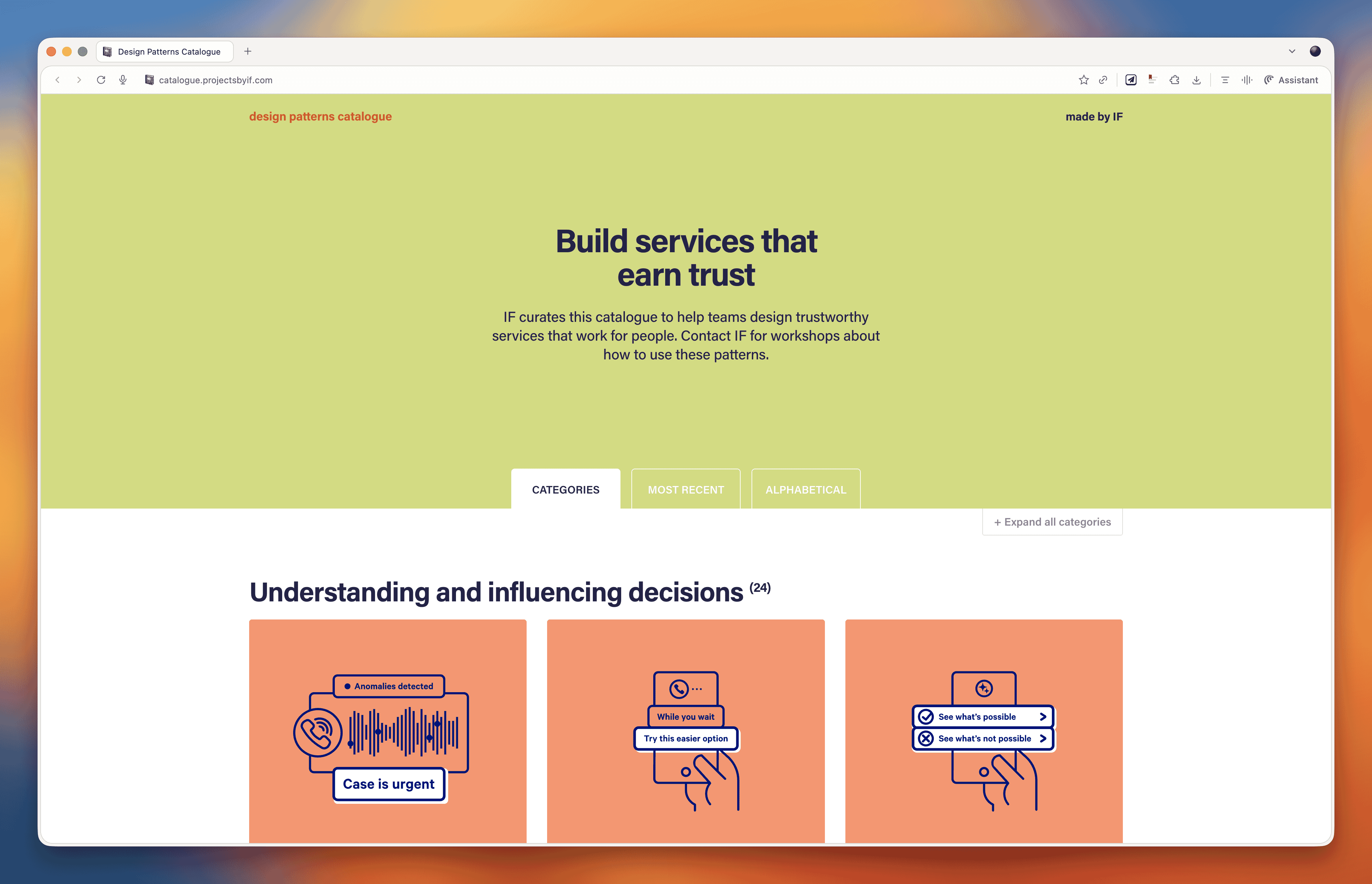
Paul found this while working on Bleet, a tool that automatically extracts advice from your recorded meetings and turns it into social media content. The trust challenge there is obvious: you're uploading client meetings with confidential information, so finding patterns for building that trust was essential.
Marcus's Joke
"I dropped a tub of margarine on my foot two weeks ago. I can't believe it's not better."
13 January 2026, 12:00 pm - 1 hour 3 minutesSurviving Crisis: Lessons from Higher Ed's Financial Storm
In this episode, we welcome back Andrew Millar from the University of Dundee to discuss the current state of higher education, vibe coding platforms for non-developers, and the importance of community-driven conferences like Scottish Web Folk.
App of the Week: Bolt.new
This week we're looking at Bolt.new, a vibe coding platform designed specifically for non-developers. Unlike tools like Cursor that are built for developers to pair program with AI, Bolt is aimed at people like marketers, designers, and small business owners who want to create functional applications without ever touching code.
Paul has been using Bolt to build practical tools for his own business, including a custom top task analysis app, WordPress plugins, JavaScript extensions, and CSS animations. The platform handles everything from the database to publishing and hosting, making it genuinely accessible for non-technical users.
However, we'd caution against treating these tools as production-ready for enterprise use. They're excellent for prototyping, internal tools, and small-scale applications, but they likely won't pass rigorous quality control in larger organizations. Think of them like desktop publishing was in the early days. They democratize creation but don't eliminate the need for professional expertise.
For production-ready code, the real value comes when developers use AI pair programming tools where they can review, understand, and quality-check the output. The future likely involves professionals using these tools to increase productivity rather than replacing expertise entirely.
Topic of the Week: The State of Higher Education and Digital Transformation
Andrew Millar, who runs the digital team at Dundee University, joins us to paint an honest picture of the current higher education landscape. It's not pretty, but his candid insights offer valuable lessons for anyone navigating organizational crisis, whether in universities or elsewhere.
The Perfect Storm Facing Universities
Higher education has always claimed poverty, but the structural problems have become impossible to ignore. Universities face two fundamental financial challenges: funding per student hasn't kept pace with inflation over the past decade, and research grants typically only cover around 80% of actual costs, leaving institutions to make up the difference.
International students became the solution to plug this gap. They could be charged higher fees and effectively cross-subsidized teaching for domestic students and research activities. This worked until a perfect storm hit: COVID disruptions, international conflicts, hostile government rhetoric toward international students, and for Dundee specifically, the Nigerian economy's collapse, which dramatically reduced one of their key international markets.
Dundee found themselves with a 30 million pound deficit. Within a year, the principal resigned, the entire executive changed, the Scottish government stepped in with emergency funding, and 500 staff members have left from a workforce of around 3,000.
The Three Phases of Crisis Management
Andrew outlined three distinct phases organizations go through during financial crisis, and his framework offers practical guidance for anyone facing similar situations.
Phase 1: Cut, Cut, Cut
When crisis hits, budgets get slashed, often multiple times. Andrew recommends categorizing everything into three buckets: what's absolutely critical to keep the lights on, what will hurt but won't cause lasting harm, and what's easy to eliminate. This is actually an opportunity to clear out legacy systems and processes that nobody uses but somehow persist.
The challenge is that during this phase, people aren't open to change or new ways of working. They just want to see the existing stuff cut. Don't waste energy trying to introduce innovations here. Focus on strategic pruning.
Phase 2: The Great Spaghetti Flying Contest
This is where everyone becomes an expert on how to solve the crisis. Phrases like "we should at least try it" and "isn't it good to test ideas?" fly around constantly. The problem is that these are the exact phrases digital teams have been using for years to encourage experimentation, now thrown back at them by people with competing priorities.
Governance structures become critical here. You can clarify requests (ensuring they're truly worth pursuing), compromise on scope, or clog them up in committees until priorities become clearer. When your escalation paths have collapsed, as they did at Dundee when leadership departed, you're left justifying decisions without backup.
The key insight: never say "computer says no" via email. Have conversations. Explain your reasoning. When people understand the constraints, they typically accept them. Email refusals just get escalated to whoever shouts loudest.
Phase 3: The Big Squeeze
With less money, fewer people, less institutional knowledge, and no clear strategy, this phase is when things get really difficult. But paradoxically, it's also when people become more open to change. They've accepted that old ways aren't working and are more receptive to credible, evidence-based proposals for doing things differently.
Digital Team Transformation and the Hub-and-Spoke Model
Andrew's team has evolved significantly since their original digital transformation work. They reduced the number of people managing the corporate website from 350 to about 20 while maintaining quality. Now they're moving toward a hub-and-spoke model, with centralized governance but distributed execution.
The ideal version of this model, which IBM pioneered, has people embedded in individual departments but reporting into the central digital function. This creates healthy tension, since they need to keep their central manager happy while also serving their local colleagues. It maintains standards while building subject matter expertise across the organization.
One emerging priority is what Andrew calls "generative engine optimization," ensuring content is structured so AI tools can accurately surface and represent it. As more users get information through AI intermediaries without ever visiting your website, getting this right becomes critical.
The Value of Community: Scottish Web Folk
The conference that inspired this episode, Scottish Web Folk, emerged partly out of necessity. When travel budgets got cut, Dundee created their own event. It's now grown to over 150 attendees with strong sponsor support, all while maintaining its community-first ethos.
The conference bans sales pitches from sponsors, limiting them to 30 seconds of self-promotion. Instead, it emphasizes knowledge sharing between suppliers and institutions. This approach keeps sponsors coming back because they recognize that embedding themselves in the community pays long-term dividends.
For any digital team, hosting events like this builds internal credibility and external relationships simultaneously. It positions you as thought leaders within your organization while creating the networks that sustain careers and enable collaboration across institutional boundaries.
Marcus's Joke
"I started dating a zookeeper, but it turned out she was a cheetah."
That's a wrap for this episode. See you in the new year!
23 December 2025, 12:00 pm - 58 minutes 4 secondsE-commerce UX Secrets: What 200,000 Hours of Research Reveals About Conversion
If you run an e-commerce site or work on digital products, this conversation is packed with research-backed insights that could transform your conversion rates.
Apps of the Week
Before we get into our main discussion, we want to highlight a couple of tools that caught our attention recently.
UX-Ray 2.0
We talked about this last week, but it deserves another mention. UX-Ray from Baymard Institute is an extraordinary tool built on 150,000 hours (soon to be 200,000 hours) of e-commerce research. You can scan your site or a competitor's URL, and it analyzes it against Baymard's research database, providing specific recommendations for improvement.
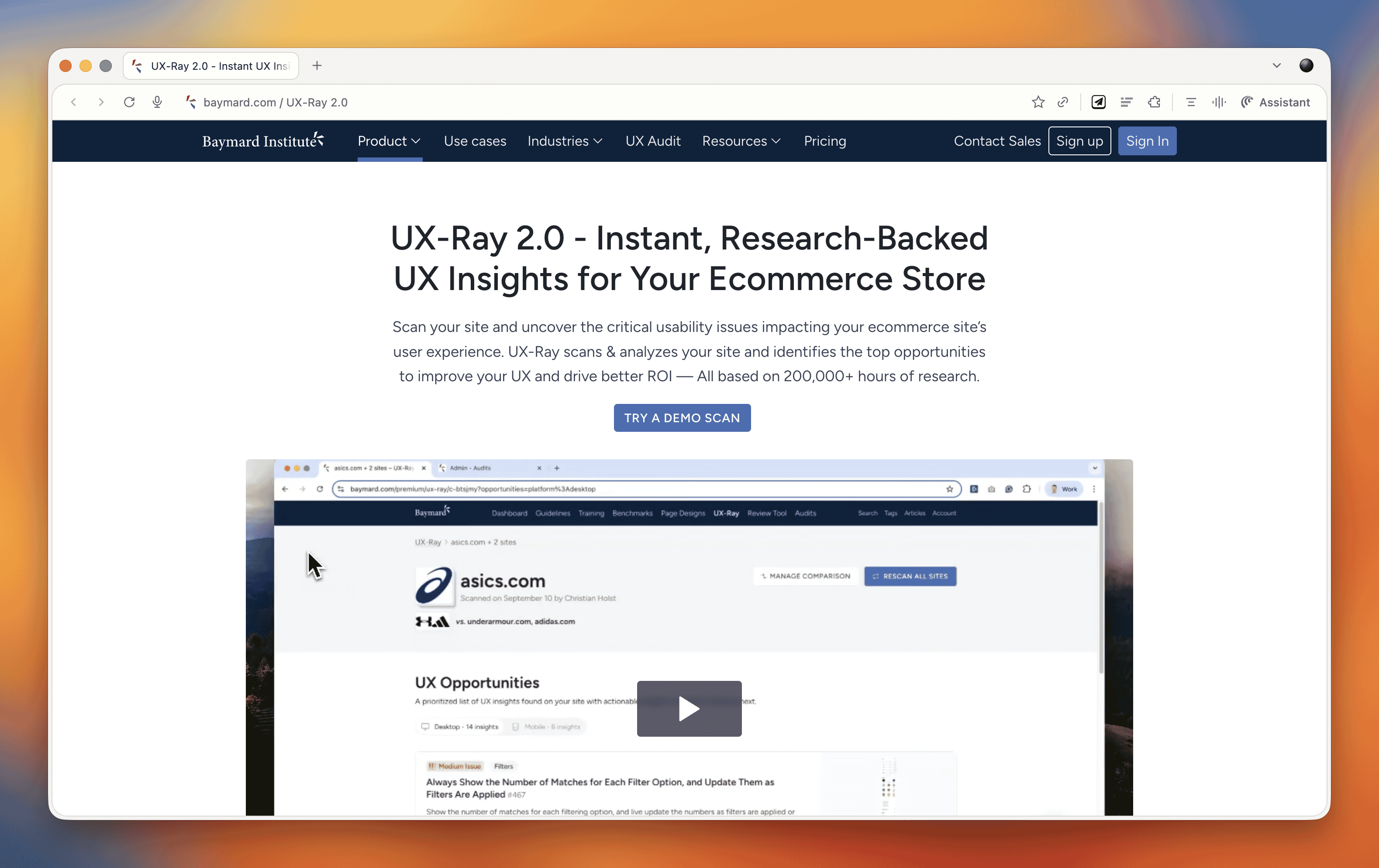
What makes UX-Ray remarkable is its accuracy. Baymard spent almost $100,000 just setting up a test structure with manually conducted UX audits of 50 different e-commerce sites across nearly 500 UX parameters. They then compared these line by line to how UX-Ray performed, achieving a 95% accuracy rate when compared to human experts. That accuracy is crucial because if a third of your recommendations are actually harmful to conversions, you end up wasting more time weeding those out than you saved.
Currently, UX-Ray assesses 40 different UX characteristics. They could assess 80 parameters if they dropped the accuracy to 70%, but they chose quality over quantity. Each recommendation links back to detailed guides explaining the research behind the suggestion.
For anyone working in e-commerce, particularly if you're trying to compete with larger players, this tool is worth exploring. There's also a free Baymard Figma plugin that lets you annotate your designs with research-backed insights, which is brilliant for justifying design decisions to stakeholders.
Snap
We also came across Snap this week, which offers AI-driven nonfacilitated testing. The tool claims to use AI personas that go around your site completing tasks and speaking out loud, mimicking user behavior.
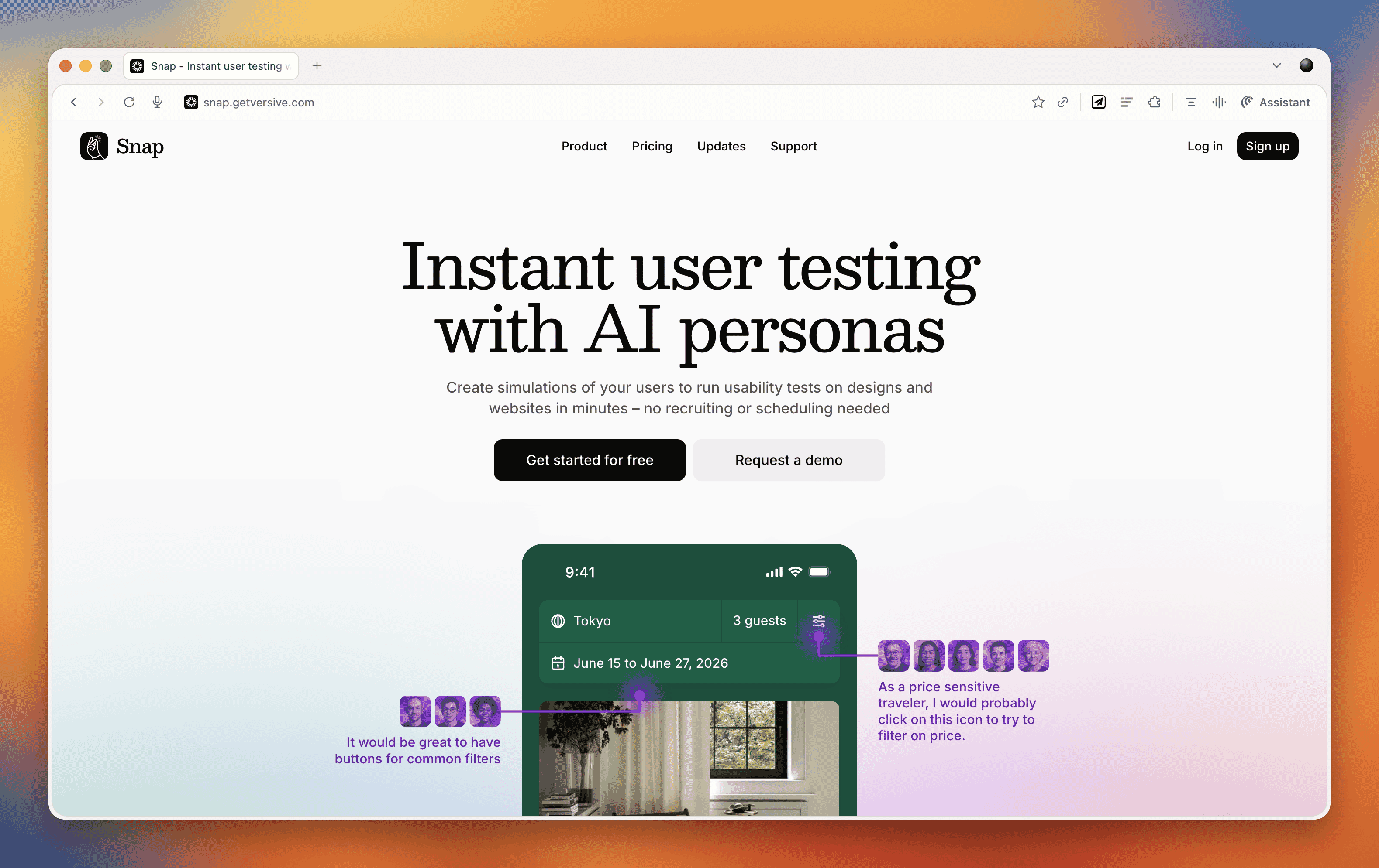
These kinds of tools do our heads in a bit. On one hand, we're incredibly nervous about them because they could just be making things up. There's also the concern that they remove us from interacting with real users, and you don't build empathy with an AI persona the way you do with real people. But on the other hand, the pragmatic part of us recognizes that many organizations never get to do testing because management always says there's no time or money. Tools like this might enable people who would otherwise never test at all.
At the end of the day, it comes down to accuracy and methodology. Before using any such tool, you should ask them to document their accuracy rate and show you that documentation. That will tell you how much salt to take their output with.
E-commerce UX Best Practices with Christian Holst
Our main conversation this month is with Christian Holst, Research Director and Co-Founder of Baymard Institute. We've been following Baymard's work for years, and having Christian on the show gave us a chance to dig into what nearly 200,000 hours of e-commerce research has taught them about conversion optimization.
The Birth of Baymard Institute
Christian shared the story of how Baymard started about 15 years ago. His co-founder Jamie was working as a lead front-end developer at a medium-sized agency, and he noticed something frustrating about design decision meetings. When the agency prepared three different design variations, the decision often came down to who could argue most passionately (usually the designer who created that version), the boss getting impatient and just picking one, or the client simply choosing their favorite.
Rarely did anyone say they had large-scale user experience data to prove which design would actually work better. They realized they could solve this problem by testing general user behavior across sites and looking for patterns that transcend individual websites. If they threw out the site-specific data and only looked for patterns across sites, they could uncover what are general user behaviors for specific UI components and patterns.
It started with just checkout flows. It wasn't even clear they would ever move beyond that. But now, 15 years later, Baymard has a team of around 60 people, with 35 working full-time on conducting new research or maintaining existing research.
The Role of Research-Backed Guidelines
One important point Christian emphasized is that Baymard's research isn't meant to replace your own internal testing. You should always do your own data collection and usability testing. The point of having a large database of user behavior and test-based best practices is that when you're redesigning something, you have maybe 100 micro decisions to make. You can't run internal tests for every single one of those decisions.
Even Fortune 500 companies that have the budget don't have the time to wait for results on every micro decision. So what happens is you collect research on the two or three big things that are site-specific or unique to your brand or customer demographic. But all the generic stuff (how to design an expand and collapse feature, how the quantity field should work, how the phone field should be designed in a checkout flow) these are extremely standardized UI components where users have standardized expectations.
You shouldn't squander your internal test resources on testing things that are completely generic. That's where pre-made research comes in. It removes 97 of the micro decisions so you can focus your resources on what's unique and important to your brand.
Common E-commerce Conversion Killers
We asked Christian what kills conversion the most on e-commerce sites. While it depends on each site's specific issues, there are some concrete things Baymard has consistently seen sites fail at that are surprisingly easy to fix.
The Order Review Trap
In countries where you have an order review step (where users review the whole order before pressing "place order"), there's a really dangerous trap. The order review step and the order confirmation step look very similar in users' minds. Both are textual pages that appear after entering credit card data. Both show a summary of information.
In testing, Baymard consistently sees some users misinterpret the order review step for a confirmation step. This is a critical error because these users will exit the page thinking they've completed their order. They don't even realize the abandonment occurred. It's the worst type of checkout abandonment that can happen.
A very simple trick is to take the "place order" button that you usually have at the bottom of the page and duplicate it so there's also one at the top of the page. One audit client did this and got a $10 million return on investment from just duplicating that button. It won't affect 10% of users, but if it prevents one out of 200 users from abandoning, that's half a percent of all your site revenue you've recovered.
Error Recovery Experience
Christian called this "the least sexy but most important topic" in checkout flows. The general error recovery experience in checkout flows has improved over the 15 years Baymard has been researching, but it's still way too poor.
When a validation error occurs, users struggle with three things:
- Understanding that an error actually happened
- Understanding where the error is
- Understanding how to resolve it
Best practices for error recovery:
- Provide visual styling for each field that's wrong
- Have a description at the top of the page that outlines all errors
- Use conditional logic: if there's only one error, scroll them to that field. If there are multiple errors, scroll to the top where they can see the overview
Baymard sees users who fix one error, resubmit, and then get frustrated when the page reloads with another error they didn't see. They sometimes conclude the page is broken. When Baymard surveys users, 6% say they've abandoned a checkout flow in the past quarter due to perceived technical errors. Most of these aren't actual technical errors, the page is just extremely complicated to use.
Adaptive Error Messages
Instead of saying "phone number is invalid," tell users exactly why. Your technical system knows exactly which validation rule was triggered. If the phone number is wrong because it includes a special character, tell them: "Special characters cannot be used. You don't need to include the country code." If it's too long or too short, say that specifically. This helps users recover faster.
Ideally, much of this should be fixed in the backend. Postcodes are a great example, some people put a space in UK postcodes, some don't. Some write it all uppercase, some use mixed case. Why isn't this fixed in the backend? There should be something tidying it up and dropping it into the database in the correct format.
Product Data and Imagery
One area where Baymard has seen genuine improvements is around product data and product imagery. Most sites took a long time to figure out that the content on the product details page is crucial to user experience.
When users land on a product details page, 90-95% of what they do as a first action is look at the image. But they also use images for tasks where it's a terrible idea. For instance, if trying to figure out whether a speaker has the right connection, instead of going to the specification sheet, they look for images showing the speaker from the back to see the connections. If they can't see it, they conclude it doesn't have the connection and abandon that product.
Users are extremely visually driven, even trying to use images to solve problems where it's a poor strategy. Sites need really good imagery from multiple angles, detailed videos showing what goes on visually, and proper product descriptions.
Building Trust in E-commerce
We asked Christian about building trust beyond the lazy approach of just shoving social proof and awards on the site. His insights were revealing:
Social Proof On and Off-Site
Social proof is important both on your page and off it. If people are in doubt whether to trust you, they won't trust your version of whether they should trust you. They'll go offsite to check reviews. Responding to negative reviews is crucial because it helps explain or set context. Users often seek out negative reviews more than positive ones to do due diligence. They understand not every product is perfect for every user, but they want to know if the shortcomings are relevant to them.
Return Policies and Professional Design
Clear and generous return policies help build trust. But there's also the "aesthetic usability effect", having a well-worked design without complications builds trust and credibility. Sites that look too dated will degrade trust. If something looks like it was made in the nineties, users may question if it's too unprofessional.
Simply having a site that's not too complicated to use also builds trust. If users get completely stuck, they may conclude it's too unprofessional or wonder if there's something wrong with the business.
These effects depend quite a bit on whether people know the brand. It changes dramatically if it's a large known brand versus a completely unknown small site with new users.
The Future: AI and E-commerce
We couldn't resist asking Christian about AI's impact on e-commerce. There are similarities to when voice applications came out five or six years ago. Everyone said we'd order everything with our voice, but that didn't really happen. This time may be different, but it won't go as fast as people think, at least not for all purchases.
There are some commodity items and household staples you just want restocked when they run out. Those are well suited for AI purchasing, the same type of products you'd buy on subscription today. But many purchases require users to be in control.
Where AI is already changing things massively is not in the complete purchase but in research and product discovery. Which digital camera should I buy? Which one is best for my requirements? This has always been an offsite experience. Users typically have multiple e-commerce sites, review sites, blogs, and social media open when researching purchases. That part is changing rapidly with AI.
But going from winnowing down millions of products to a few options, then having AI auto-purchase one of them, will take quite a while before users are that confident. It may even be generational, people our age may never fully trust it even when it becomes trustworthy, while the next generation growing up with competent AI will develop different habits.
Final Thoughts
What really strikes us about e-commerce optimization is how it's death by a thousand cuts. It's not that one of these things will wreck your conversion rate, but collectively they cause real problems. When you're dealing with an entire e-commerce site, there are so many little things that it's impossible to plan for all of them upfront. You will miss things.
That's why post-launch optimization is crucial. There will always be things that need improving, and that ongoing work can span years. It's a big job, but the research and tools that organizations like Baymard provide make it far more manageable than trying to figure everything out from scratch.
Marcus's Joke
And now, as always, Marcus leaves us with his joke of the week:
"My dad suggested I register for a donor card. He's a man after my own heart."
That's actually quite good, Marcus. We'll allow it.
18 November 2025, 12:00 pm - 59 minutes 30 secondsFreelancing for Small Businesses: Real World Budget Constraints and High Stakes
Welcome to Episode 27 of the Boagworld Show, where we dive into a side of web work that doesn't get nearly enough attention. This month, we're exploring life as a freelancer working with small businesses. We're joined by Paul Edwards, a fellow member of the Agency Academy who has spent two decades serving clients that don't have massive budgets or sprawling marketing teams. If you've ever wondered how best practice advice translates to the real world of limited resources and high stakes, this conversation is for you.
App of the Week: Baymard UX-Ray
Before we get into our main conversation, we need to talk about an extraordinary tool that just launched. Baymard UX-Ray is built on the Baymard Institute's 150,000 hours of ecommerce research. If you're not familiar with Baymard, they've been conducting rigorous usability research for years, building an enormous repository of what actually works in ecommerce design.
What makes UX-Ray remarkable is how it applies all that research. You can input your own site or a competitor's URL, and the tool scans it against Baymard's research database. It then provides specific recommendations for improvement, each one linked back to detailed guides explaining the research behind the suggestion.
Now, we'll be honest. Tools like this can feel a bit depressing when you first encounter them. Another thing that AI can do that used to be our job, right? But the reality is more nuanced. You still need expertise to ask the right questions, to know when to ignore advice that doesn't fit your situation, and to implement recommendations effectively. What UX-Ray really does is democratize access to quality research, allowing smaller teams and solo practitioners to benefit from insights that would otherwise require a massive research budget.
For anyone working in ecommerce, particularly if you're trying to compete with larger players, this tool is worth exploring.
Life as a Freelancer Serving Small Businesses
Our main conversation this month centers on something we don't discuss enough in the UX and web design community. Most of the advice you read online, most of the case studies and best practice articles, come from people working with large organizations. We're guilty of this too. Between the two of us, we've worked with clients like Doctors Without Borders, GlaxoSmithKline, and major universities. That shapes our perspective in ways we don't always recognize.
Paul Edwards brings a different lens. He's spent 20 years as a freelancer, and while he's worked with organizations of varying sizes, the common thread through his client list isn't scale. It's circumstance. His clients typically have small or nonexistent marketing teams. They're often time-poor and lack technical expertise. Most importantly, they have skin in the game in a way that corporate clients rarely do.
The Origin Story
Paul's freelance journey started dramatically. On November 5, 2005, he had a tantrum at his job as a commercial manager for a civil engineering company and quit on the spot. No savings, no business plan, no real idea what he was doing. He just knew he'd been teaching himself web design with Dreamweaver and Fireworks, and he thought maybe he could make a go of it.
What followed was the classic freelancer trajectory. He worked his friends and family network, which led him into academia and international development work. He found himself building sites for projects funded by the Bill and Melinda Gates Foundation, DFID, and the World Bank. These weren't necessarily well-funded projects despite the prestigious funders, but they gave him experience working with agencies across Europe and projects in Africa focused on critical issues like hygiene and sanitation.
What Makes Small Business Work Different
When you're working with a small business owner, the stakes are fundamentally different. As Paul put it, the number of clicks their campaign generates directly affects how much money they take home at the end of the month and the security of their family. That changes everything about the relationship.
This isn't to say working with large organizations is easy or that the work doesn't matter. But in a corporation, success and failure are distributed across many people and many factors. When you're working with someone who owns their business, your work has an immediate, visible impact on their livelihood. The opportunity cost of failure is enormous. The credit for success is also more direct, which can be incredibly motivating.
Paul's business has evolved toward more retainer and time bank arrangements over project work. This shift happened gradually but has been transformative. For clients, it guarantees access to his expertise when they need it. For Paul, it provides income stability. But there's another benefit that often gets overlooked. When you have long-term retainer clients, especially small ones with staff turnover, you become a point of continuity in their organization.
One of Paul's retainer clients had a marketing department of two people. Both left within a year. Paul was literally the only person who understood the history of their digital presence, their past campaigns, and their strategic direction. That kind of institutional knowledge is incredibly valuable, and it's something freelancers can uniquely provide.
The Budget Reality
We had to ask about budget because it's the elephant in every room. When you're working with smaller clients, you simply have fewer resources to work with. So how do you adapt all the best practice advice that assumes you have time for extensive user research, iterative testing, and comprehensive documentation?
Paul's answer was illuminating. He doesn't find himself frustrated by advice that doesn't apply to his situation. He just doesn't apply it. As a generalist, he's always picked and chosen what's relevant, learning what he needs for each specific job and disregarding the rest. He can't let his head explode trying to take in everything, so he focuses ruthlessly on what matters for the work at hand.
The reality is that best practice often needs to be adapted regardless of client size. A lot of what gets labeled as essential process work serves organizational needs as much as user needs. In a large organization, you might conduct extensive research partly to align compliance, get legal on board, and protect your client contact from political fallout. In a small business where you're talking directly to the decision maker, you can move faster and iterate post-launch.
That doesn't mean cutting corners on things that matter. Paul still does discovery and research work, but he structures it differently. Rather than one large project with research baked in, he often does pre-project discovery as separate billable work. This allows him to flex the scope based on what the client has in-house, what they lack, and what will actually move the needle for them.
Filtering Clients and Managing Risk
One of the most valuable parts of our conversation was Paul's approach to client selection. He's learned through hard experience that taking on a client who isn't a good fit costs far more in stress and lost time than the revenue is worth. Every single time he's taken someone on when his gut said no, it's been worse than if he hadn't brought that money in.
So Paul has developed a risk scoring process. He researches Companies House filings and financial accounts. He Googles potential clients thoroughly. He makes sure to be himself from the first conversation, explaining that he's blunt and tends to say what he thinks. Some people say they want that but really don't, and it's better to discover the mismatch early.
When things do go wrong, which is rare after 20 years, Paul offboards as quickly and graciously as possible. He sees it as partly his fault for misjudging the fit, so he tries not to burn bridges. He'll help them find someone else to work with and exits professionally.
We wondered whether this kind of risk management is more necessary when working with smaller organizations. After all, you know Oxford University will eventually pay their bills, even if slowly. Paul's experience is that payment risk exists at all scales, but small businesses can have more volatile finances. However, most of his clients pay within 48 hours, which is remarkable. The key is that by moving toward retainer and time bank models where time is paid upfront, a lot of payment anxiety simply disappears.
The Generalist Advantage and AI's Role
Our conversation kept circling back to the value of being a generalist, and how AI is amplifying that advantage. Paul described AI as helping him get out of his own way. If he knows 90 percent of what's needed to help a client but lacks that final 10 percent, he used to decline the work. The opportunity cost of getting it wrong felt too high. Now, AI helps him bridge that last 10 percent with confidence.
He shared a perfect example. A trade business client, selling into the architectural sector, wanted help with their Google Ads campaign. Paul had dabbled in PPC but wasn't an expert. The client was willing to pay him to learn, which was fortunate, and AI supported that learning process. It helped him analyze the massive amounts of data that PPC campaigns generate, identify trends, and fill knowledge gaps. The result was a completely new campaign with much lower spend, a huge increase in relevant clicks, and better funnel positioning. The client was so pleased they sent him a Christmas hamper, a first in 20 years.
This is what the return of the generalist looks like. AI isn't replacing expertise. It's allowing people with broad knowledge and good judgment to tackle problems that previously required specialists. You still need to know enough to ask good questions, to recognize when something feels off, and to verify AI's suggestions. But you can now say yes to opportunities that would have been too risky before.
What Large Organizations Can Learn
Near the end of our conversation, Paul made an observation that stuck with us. While he learns constantly from working with small businesses, he thinks there's value flowing the other way too. People working with large organizations, like us, often miss things that become obvious when the stakes are personal and immediate.
When you work with a business owner who's putting their family's financial security on the line, you can't hide behind process or best practice. You have to deliver real value. You have to be adaptable. You have to become genuinely invested in their success because they're so clearly invested themselves. That kind of clarity and accountability can be harder to find in large organizational work, where responsibility is diffuse and success has many parents.
This Month's Reads
Each month, we share a few articles, videos, and resources that caught our attention and sparked interesting conversations about the state of our industry.
Functional Personas: A Practical Guide
Following up on last month's discussion about AI-generated personas, Paul has now written a comprehensive guide for Smashing Magazine. The article walks through his method for creating functional personas using AI, explaining when this approach makes sense and how to implement it effectively. If you've been curious about whether AI-generated personas can actually be useful, this piece answers that question with practical examples.
Experience Design: The Return of the Generalist
Nielsen Norman Group has posted a video arguing for a terminology shift from "user experience design" to "experience design." Their reasoning is that UX has developed a reputation problem. People think they know what it means, but they're often wrong, associating it primarily with visual interface design.
We have mixed feelings about this. The problem isn't really the word "user." It's the word "design." When most people hear design, they think of visual design and interface work, not the broader strategic and research work that UX encompasses. Changing to "experience design" doesn't solve that fundamental misunderstanding.
That said, the video makes interesting points about the return of the generalist, which aligns with much of our conversation this month. As tools like AI make specialist knowledge more accessible, there's growing value in people who can work across disciplines and see the bigger picture.
Marcus's Joke of the Week
A perfectionist walks into a bar. Apparently it wasn't set high enough.
21 October 2025, 11:00 am - 54 minutes 48 secondsDark Patterns, Bright Ideas: Why Deceptive Design Belongs in Accessibility
You know, those sneaky little tricks sites use to funnel you into doing things you never intended, like paying for insurance you didn’t want or scrolling until your thumb falls off.
We talked about why this stuff isn’t just bad manners, but also an accessibility issue, and how to push back when your boss is shouting about conversion rates. We also wandered off into personas, because what’s a Boagworld Show without a tangent or two?
App of the Week
This week app is Be My Eyes. It’s designed to support blind and low-vision users by letting them connect with volunteers (or increasingly, AI) who can describe what’s in front of them. It’s practical, humane, and a great reminder that sometimes technology really does make life easier. Unlike my dishwasher, which still beeps at me like I’m trying to launch a nuclear missile.
Topic of the Week: Deceptive Design, Accessibility, And The Real Cost Of Manipulation
This is where we rolled up our sleeves and got into the meat of it. What actually counts as deceptive design, why it’s more than just “bad UX,” and why the accessibility crowd are getting involved.
What Do We Mean By Deceptive?
There’s no single definition everyone agrees on, but the gist is: if you’re deliberately steering or trapping users into something they didn’t intend or need (and especially if it lines your company’s pockets) it’s deceptive. That’s different from an anti-pattern, which is just poor design born of ignorance.
Why It’s An Accessibility Issue
Deceptive patterns catch everyone out eventually, but they’re especially cruel to people with cognitive disabilities, attention difficulties, or those relying on assistive tech.
If you’ve ever been stuck doomscrolling until you realized it’s not lunchtime but bedtime, you’ll know the feeling. The difference is, for some users, the consequences can be more than just a lost afternoon. That’s why accessibility guidelines are starting to take these patterns seriously.
If you’re keen to see where this work is going, have a poke at these:
Where It Gets Messy
Of course, it’s rarely moustache-twirling villains plotting this stuff. Most of the time it’s teams chasing KPIs (sales, clicks, engagement) and nudging too far. That’s how you get:
- The big shiny green “Buy with insurance” button, while the “Buy without” option is hiding in grey.
- Cheaper plans buried three clicks down, so the expensive ones look like the only choice.
- The friendly phone call that turns into a hard sell for extended warranties.
On paper the numbers look great. Meanwhile, refunds, complaints, and customer churn quietly tick upward. But hey, at least the dashboard looks good, right?
The Role Of AI
AI has the potential to make things better (look at how Be My Eyes uses it) but it also risks making things worse. More chatbots standing between you and an actual human being, for instance.
At the moment we haven’t seen a tidal wave of AI-driven trickery, but the ingredients are all there. Somewhere in Silicon Valley, there’s probably a twenty-something rubbing his hands and plotting.
Pushing Back Without Becoming Unemployed
Telling your boss “this is unethical” might get you a polite nod. Showing them how deceptive patterns increase refunds, tank repeat purchases, and hike up customer support costs? That’s when people start listening. Always lead with the business case, because sadly “doing the right thing” isn’t enough in most boardrooms.
Offer alternatives that still meet goals but don’t annoy users. Equal-weight buttons. Clear language. Confirmations before adding sneaky extras. And if management still insists, put your concerns in an email so there’s a record. Nobody likes receiving an email that basically says, “I warned you.”
Personas With A Bit More Reality
While we’re at it, let’s talk personas. Most marketing personas are about as useful as a chocolate teapot. They’re built around demographics and stereotypes. King Charles and Ozzy Osbourne would end up in the same persona (same age, same country, both live in castles). Clearly useless.
Instead, think functional personas. Base them on needs, tasks, objections, and accessibility requirements.
You don’t need a “disabled persona.” Just make sure some of your personas have traits like dyslexia, ADHD, low vision, or anxiety about being conned. That way, you’ve got a ready-made reason to say, “This won’t work for Priya, who relies on a screen reader.”
The Big Picture
Deception feels like a shortcut. It isn’t. It costs you in trust, support overhead, and long-term loyalty. Treat deceptive design as an accessibility barrier, argue with data, and keep users in your personas. That way you’ll serve both your customers and your company—and maybe sleep better at night.
Read of the Week
In this week’s show we also highlighted two cracking resources:
A collection of manipulative patterns with real examples. Perfect for calling out “that thing the boss wants us to try.”
Deceptive Patterns and FAST by Todd Libby
Slides from Todd’s talk. Great for showing stakeholders that you’re not just making it up as you go along.
Marcus Joke
We’ll wrap up with Marcus’s groaner of the week:
“I told a joke on a Zoom meeting and nobody laughed. Turns out I am not even remotely funny.”
23 September 2025, 11:00 am - 58 minutes 51 secondsWhy Your UX Needs a Trust Audit
In this episode, we look at why trust is key to good UX, especially with scams, deepfakes, and AI blurring the line between helpful and deceptive. We also ask if emotion-reading apps are helpful or just unsettling, and explore the tricky process of turning services into products. Plus, we discuss a framework from Nielsen Norman Group, tackle a listener's question on productization, and end with Marcus's joke.
App of the Week
Check out Emotion Sense Pro—a Chrome extension that analyzes micro‑expressions and emotional tone in real time during Google Meet calls, while keeping all data safely on your device. It's privacy-first, insightful, and a bit unsettling. But if you're moderating user tests, hosting webinars, or running interviews, it gives a useful look into unseen emotional cues.
Topic of the Week: Trust as Your UX Superpower
This week's topic dives into why trust is absolutely essential in today's digital landscape. Here's a summary of what was discussed, but we encourage you to listen to the whole show for more detailed insights.
We're convinced trust isn't optional, it's foundational. Amid a haze of misinformation, broken customer promises, slick AI-generated content, and user fatigue, building trust isn't just ethical, it's strategic.
Why Trust Is Harder to Earn (But More Rewarding)
Trust isn't automatic anymore. Big brands used to get the benefit of the doubt. Now users are skeptical. Scams and data breaches have made people cautious. Small problems like unfamiliar checkout pages, strange wording, or awkward user flows make people suspicious.
UX Choices That Build (or Break) Trust
Keep your visuals and interface consistent so users don't have to work hard. When people get confused, they put their guard up. Think about clicking through to a payment page with no familiar branding. That tiny moment can kill trust. Messages like "Only 3 left in stock" can seem manipulative if users don't trust you yet.
Speak Like a Human
Talking about "the company" instead of "we" creates distance. Use normal conversation with "you" and "we" instead of "students" or "customers." Skip the marketing language. And remember that if your photos don't show people like your users, they might leave without saying why.
Trust-Building in Action
Here are concrete steps that showcase trust-building in real-world scenarios. Implementing these practices can transform how users perceive and interact with your digital experiences:
- Audit for trust breakpoints. Look for spots where your UI might confuse users.
- Loop in legal early. This stops compliance from ruining your tone with last-minute jargon.
- Test trust directly. Ask "Would you feel comfortable sharing your data here?" during testing.
- Use authentic social proof. Link testimonials to sources, use third-party reviews. Even better? Simple, unpolished video testimonials.
- Prioritize clarity over cleverness. Skip the buzzwords.
- Make human support obvious. This is one of the strongest trust signals you can offer.
Trust runs through every part of your experience. Get it right and it becomes your biggest advantage.
Read of the Week
This week's read is "Hierarchy of Trust: The 5 Experiential Levels of Commitment" by Nielsen Norman Group. They outline a trust pyramid:
- Baseline trust. Can the site meet my needs?
- Interest & preference. Is this better than alternatives?
- Trust with personal info. Worth registering?
- Trust with sensitive data. Can I trust you with payments?
- Long-term commitment. Will I come back?
Main point? Don't ask for level-3 or level-4 commitments before earning levels 1 and 2. Users leave when you push for sign-ups or newsletter pop-ups too early. Build trust in stages.
Listener Question of the Week
"Is productizing my services a good idea, and if so, how should I approach it?
It depends. Productisation can add clarity but might limit your value by putting your service in a rigid box. We find it works better to focus on outcomes rather than fixed processes.
If you do want to productise:
- Focus on the outcome, not the deliverable. Example: "Conversion rate strategy" not "5 interviews and wireframes."
- Stay flexible. Your process should change as the project develops.
- Don't use fixed pricing that punishes change.
- Think about your service's value, not just features.
Most of us will get further with a custom toolkit and clear outcomes than a one-size-fits-all "product."
Marcus’s Joke
“I removed the shell from my racing snail. I thought it would make it faster, but if anything, it’s more sluggish.”
19 August 2025, 11:00 am - 56 minutes 15 secondsScaling UX in a Decentralized World: Inside Oxford
In this episode, we chat with Sarah Zama from the University of Oxford about how she's helping to influence UX across one of the most complex and decentralized organizations in the world.
We explore how she built a UX center of excellence almost from scratch, how the team is transforming culture through coaching and community, and what it takes to push UX forward in a challenging environment. There's also a digression into Apple's questionable design choices, a fantastic app recommendation, and of course, Marcus' joke.
App Of The Week
This week’s app recommendation is Zuko Form Analytics. It’s an incredibly helpful tool for anyone involved in conversion rate optimization or form design.
Zuko tracks detailed interactions with every field in a form—like how long someone spends in a field, where they drop off, and what fields trigger abandonment.
You get session-level insights, and it all works via a simple JavaScript snippet. There's a free tier to get started (up to 1,000 sessions), and pricing starts around £40/month for 5,000 tracked sessions. It’s the kind of tool we wish we’d known about sooner.
Topic Of The Week: Building UX Capability at Oxford University
We were thrilled to be joined by Sarah Zama, UX Lead at the University of Oxford, to discuss a journey we’ve had the privilege of being part of: building a UX center of excellence in one of the most decentralized institutions in the world.
Getting Started With Limited Resources
Paul originally worked with a small team at Oxford to create the business case for a UX team, ultimately recommending a center of excellence model rather than a centralized tactical team.
Why? Because hiring enough UXers to match developer headcount across such a massive organization was never going to be viable. Instead, a small, strategic team could focus on enabling others.
Sarah took that vision and ran with it. She started with a written plan—not just a strategy that collects dust but a living, practical document with measurable outcomes. She quickly assembled a lean team, brought in an existing accessibility lead, and even secured a six-month secondee to help with projects and spread good UX practice further into the organization.
A Consultative, Empowering Approach
The Oxford UX team doesn’t do UX for people. Instead, they help others do UX better. Through consulting, coaching, training, and providing reusable assets (like a design system), the team makes itself useful across a broad landscape without getting dragged into execution.
This consultative model includes:
- Workshops to support high-profile projects
- Guest training sessions with external speakers
- Custom-built resources tailored to Oxford’s context
- Supportive relationships with departments already doing good UX
They’ve also cleverly leveraged accessibility requirements as a wedge to introduce better UX thinking, combining compliance with best practices to gain traction.
Growing a UX Culture
Perhaps most impressively, Sarah and her team have focused on growing a UX culture through grassroots advocacy. They’ve built a UX Champions network that now includes over 150 people from across the university. This community shares knowledge, resources, and a passion for improving user experience, even when UX isn’t in their job title.
It’s a smart way to scale. By empowering individuals and embedding UX thinking across departments, Sarah's team extends its reach far beyond what any centralized team could manage.
The Frustrations and the Wins
Sarah admits the biggest challenge is visibility. Getting buy-in across such a large institution takes time and constant communication. There’s also the frustration that people still perceive UX as a cost or blocker rather than an enabler of success.
But the wins are meaningful. A growing, skilled team. A network of passionate advocates. And projects where UX clearly moved the needle. Sarah credits much of the team’s progress to strong collaboration, openness to learning, and sheer persistence. It’s a long game, but one that’s already paying off.
You can follow Sarah’s team and explore their resources at staff.admin.ox.ac.uk/ux. They welcome feedback, iteration, and anyone who wants to borrow from their growing UX playbook.
Read Of The Week
This episode’s recommended read is The Leadership Dilemma, an article Paul wrote for Smashing Magazine. It reflects on the exact challenges Oxford faced: how do you scale UX influence when your team is too small to do all the work? The article walks through a strategic approach to UX leadership that empowers others, shifts the organizational mindset, and creates lasting change.
If you’re trying to build UX maturity in a large or slow-moving organization, this is worth your time.
Question Of The Week
This week’s question wasn’t submitted via email but came up naturally during the show: "What does a typical week look like for a small UX team in a large organization?"
Sarah’s answer? There’s no such thing as a typical week. Her team works on everything from:
- Running UX training
- Providing design and accessibility consultations
- Participating in project meetings
- Developing shared resources like design systems
They also embed temporarily into project teams to upskill staff, run workshops, and seed best practices. Some team members even take secondments into other departments to help spread UX thinking more deeply.
All of this reflects their consultative, empowering model. It’s not about building everything themselves but enabling others to build better.
Marcus' Joke
And finally, Marcus graced us with this gem:
"When I was young, I thought rich people owned Bose music systems and the rest of us had Sony products. Turns out they were just stereotypes."
We’ll let you groan in your own time.
Thanks for reading, and we’ll be back soon with another episode!
22 July 2025, 11:00 am - 55 minutes 28 secondsThe Future Of UX With Jared Spool
Joining me, Paul, are Marcus Lillington and Jared Spool, and together we explore how UX needs to reposition itself, what AI really means for designers, and how to navigate the current UX job landscape without losing hope. We also touch on some interesting new tools from Figma and an exciting AI-assisted prototyping app that could change how we work.
App of the Week
This episode highlights two key apps making waves in the design space:
Figma Sites
Announced recently at the Figma conference, this new tool aims to let you publish websites directly from Figma, competing with players like Webflow and Framer. However, we share a healthy dose of skepticism about its current capabilities—especially its accessibility issues and lack of data entry support, which limits its usefulness beyond very simple sites.
Readdy
This AI-powered assisted coding tool stands out as a promising alternative. Unlike traditional prototyping in Figma, Ready lets you describe your UI in natural language, and it generates real HTML and CSS code that’s responsive and supports data entry. This means you can create interactive prototypes faster, test them in real-world conditions, and iterate with ease. It’s not about replacing designers but augmenting their productivity, and it offers a glimpse into how AI can support design workflows in practical ways.
The Future of UX, AI, and the Job Market
We begin by reflecting on the state of UX and where it’s headed, especially with AI’s rapid development changing the landscape. Jared shares his ongoing work guiding UX professionals to unlock their full potential within organizations, emphasizing the gap between what UX can deliver and what’s often realized. This disconnect often results from a lack of awareness or understanding within teams, and Jared’s leadership sessions aim to close that gap.
AI’s Impact on UX Design
We delve into AI tools emerging in design, focusing particularly on generative AI and assisted coding. While AI is often hyped as a threat to designers, we agree it’s more of a productivity booster than a replacement. AI lets us do more with less effort, but it doesn’t eliminate the need for thoughtful, skilled UX design. The analogy Jared uses — comparing AI’s rise to previous tech shifts like blacksmiths transitioning to new materials — reminds us that professions evolve rather than vanish overnight.
We discuss the limitations of current AI design tools, such as Figma Sites, which lack the sophistication needed for anything beyond very basic websites. On the other hand, Readdy offers a more practical approach by generating actual working code through conversational commands. It’s a step forward but still not a magic bullet. The process requires human input, iteration, and adjustment, which is where UX professionals continue to add value.
An interesting angle comes from the critique of AI as reinventing the command line — a somewhat clunky, text-based interface for describing complex UIs. This makes it tricky to fully express the nuances of design and iterate quickly, especially in production environments where prototyping demands fast, precise changes.
The UX Job Market Reality
Turning to the job market, Jared offers a clear-eyed analysis: although there are more UX jobs available now than ever before, there are also far more UX professionals competing for them. The result? Overcrowded job listings and intense competition, especially for junior roles. The industry isn’t shrinking; rather, it’s saturated.
He points out that the issue isn’t job scarcity but a mismatch between experience levels and job requirements. Many bootcamp graduates enter the market with limited experience, and companies often prefer hiring senior candidates to junior ones due to cost efficiency and immediate impact. For those struggling to find work, Jared advises gaining real-world experience by volunteering on meaningful projects with tangible outcomes, like improving a local charity’s website to boost adoption rates.
For senior professionals, the key is precision: tailoring applications meticulously to each job posting and clearly demonstrating how your skills match the role. Generic resumes won’t cut it when hiring managers sift through hundreds of applicants. This targeted approach greatly improves the chances of landing interviews and offers.
Looking Ahead: Will AI Replace UX?
We debate an intriguing prediction by Jakob Nielsen that many UX battles are “won” and that AI might replace human interaction with websites entirely, as AI agents fetch and personalize content for users. While fascinating, we question the commercial and practical realities. Advertisers still rely on website visits for revenue, and user experience involves more than information retrieval; it’s about connection, context, and trust.
We emphasize the enduring importance of educating organizations about real UX issues, including accessibility and ethical design topics that remain under appreciated despite technological advances.
Final Thoughts
The conversation wraps on an optimistic note: despite challenges, UX as a profession is robust, filled with opportunity, and evolving with new tools and methods. The future may be uncertain, but it’s far from bleak. Embracing AI as an aid, not a threat, and focusing on building relevant experience and clear communication skills will serve UX professionals well.
Marcus Joke
To lighten the mood, Marcus closes with a classic:
“I went to a zoo and saw a baguette in a cage. Apparently, it was bred in captivity.”
Thanks for tuning in to this week’s episode. Whether you’re grappling with AI’s role in design or navigating a tough job market, we hope this conversation gives you clarity and confidence to move forward. See you next time!
16 June 2025, 11:00 am - 49 minutes 50 secondsCreating Personality-Driven Design Experiences
Creating Personality-Driven Design Experiences
In this week’s episode of the Boagworld Show, we’re joined by none other than Andy “The Pioneer” Clarke. We dig deep into the role of aesthetics in UX, explore how AI can conduct user interviews, and debate how to approach pricing conversations with clients. Alongside our usual banter, you’ll find insights into why design needs personality and how creative direction can add real value, whether you’re designing marketing sites or B2B dashboards.
We also introduce a new AI-powered user research tool, share some standout reading recommendations, and end with the usual Marcus groaner (you’ve been warned).
App of the Week: Whyser
This week we took a look at Whyser, an AI tool designed to conduct user interviews on your behalf. You simply set up your interview goals and questions, and the AI takes care of the rest; scheduling, conducting, and even analyzing interviews.
What impressed us most was how well the AI adapted its questions based on our answers. It felt remarkably natural and even asked follow-up questions relevant to what we’d said earlier. That’s a big deal for those of us who struggle to find time to do interviews at scale.
Whyser isn’t without its drawbacks; it does put a layer between you and your users, which can dilute the empathy you build through real human conversation. But if time or access is limited, this could be a game changer. Especially helpful for teams that rarely get to talk to users directly.
Topic of the Week: Why Aesthetics Still Matter in UX
We hear it all the time: “Design is about solving problems.” That’s true, but it’s not the whole picture. In this episode, we explore the undervalued role of aesthetics in UX and why visual design, art direction, and brand personality still matter.
From Usable to Memorable
We kicked off with a discussion about how too many websites today feel like “colored-in wireframes.” They’re functional but lack soul. The shift toward product-thinking has stripped personality from digital experiences. As Andy put it, “Everything looks like Bootstrap.”
Yet, personality plays a critical role in how users connect with your brand. Whether it’s a SaaS dashboard or a marketing homepage, how a product feels impacts engagement, trust, and even long-term retention. People stick around when something makes them feel something—even if they can’t quite explain why.
The Cognitive Load Link
There’s a practical side to aesthetics too. Good design improves usability not just through layout but also by boosting mood. A more pleasant experience reduces cognitive load, making interfaces feel easier to use.
That means aesthetics aren’t just about making things pretty; they’re a lever for user performance and satisfaction. It’s not fluff; it’s function wrapped in emotion.
Art Direction in Unlikely Places
Andy gave a great example from his time working on a cybersecurity app. Hardly a glamorous field, yet he found space to inject moments of brand personality through microinteractions, onboarding flows, and visual consistency. Even in utilitarian tools, design can reflect a brand’s values and improve the user experience.
As he put it: “You don’t need to delight, but you do need to differentiate.”
Reframing Creativity
The problem, we all agreed, starts in education. Many young designers are trained to focus on flows, not feelings. They're brilliant at getting users from A to B but haven’t been taught how to make that journey enjoyable or memorable.
Andy argued that curiosity is the missing ingredient. Design isn’t just about function, it’s about communication. And communication thrives on references, storytelling, and creativity. He showed us how keeping a library of visual influences, whether it’s old magazine layouts, album covers, or supermarket packaging, can help inject new life into projects.
Selling the Value of Aesthetic Thinking
Websites are easy to build these days. What clients are really paying for is the ability to tell their story well. That’s where we, as designers, add value.
Andy’s take? Spend 95% of your budget on creativity and 5% on implementation. Tools like Squarespace can handle the build, what matters is how it looks, feels, and communicates. That’s where your edge lies.
And when clients say, “But we already have a brand,” the job becomes about interpreting that brand, stretching it into a full visual language, not just slapping a logo onto a template.
So if you’ve felt the creative spark dimming lately, maybe it’s time to step away from your Figma files and pick up an old design annual, flick through a vintage magazine, or just take a walk with curiosity as your guide.
Read of the Week
This week we didn’t highlight specific articles, so no recommended reading to share. That said, the conversation itself was rich with references; from Blue Note album covers to 'Smash Hits' magazine layouts—and might inspire you to go digging through your own design bookshelf.
Listener Question of the Week
We didn’t have a listener question either, but the discussion turned to one that’s always on designers’ minds: How do I handle client feedback without compromising the design?
Andy’s advice was simple but brilliant: only give clients choices over things they can’t mess up. Stakeholders will always want to contribute; so let them. But steer them toward harmless decisions. Let them choose between two acceptable color variations or headline treatments, but don’t give them free rein over critical layout or concept work unless you're okay with every option on the table.
Another smart tip: give clients creative choices using metaphors. Instead of asking “Do you want this to feel formal or informal?” ask “If your brand were a movie or celebrity, who would it be?” It’s a great way to pull out emotional nuance without falling into clichés like “trustworthy” and “professional” (which, let’s face it, everyone says).
And finally, validate your design decisions with user testing. Don’t let testing dictate the design, but do use it to confirm you’re on the right track. That way, you move from subjective opinions to informed decisions and you keep the project moving forward.
Marcus's Joke
And to close the show, here’s Marcus’s joke (we apologize in advance):
Scientists have found that cows produce more milk when the farmer talks to them.
Apparently, it’s a case of in one ear and out the udder.
We’ll leave you to groan in peace.
Thanks for listening, or reading, if you’re one of our show notes faithful. If you enjoyed Andy’s insights, be sure to check out his work over at Stuff & Nonsense. Until next time!
22 May 2025, 11:00 am - More Episodes? Get the App